UI
AIQC makes comparing and evaluating models effortless with its reactive Dash-Plotly user interface. The following dashboards put precalculated metrics & charts for each split/fold of every model right at your fingertips.
Reference the Evaluation section for more information about the plots and metrics.
Experiment Tracker
![]()
During the training process, practitioners continually improve their algorithm by experimenting with different combinations of architectures and parameters. This iterative process generates a lot of post-processing data, and it’s difficult to figure out which model is the best just by staring at hundreds of rows of raw data.
Compare Models Head-to-Head
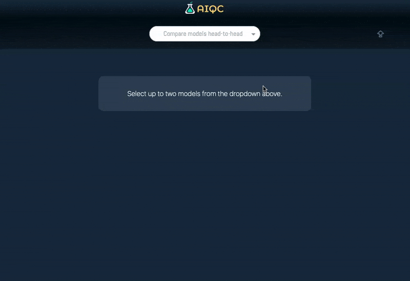
The head-to-head comparison provides a deep dive that helps tease out the answers to challenging questions:
How does a practitioner know that ‘model A’ is actually better than ‘model B’ for their use case? Is one model slightly more biased than the other? What characteristics in the data is each model relying on? Can we get higher performance if we train for just a bit longer?
What-If Analysis
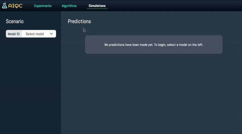
Ever wonder “What if?” By providing a dynamic user inferface for inference, AIQC allows you to tweak the inputs for a scenario in order to simulate its outcome.
Its applications are endless: Will the patient survive if their blood pressure drops? Will this drug be effective with 1 more rotational bond? Will the gene editing increase CO2 sequestration?
By default, the feature inputs are populated with either the median numeric/ mode categoric value depending on their dtype. Metadata about the feature’s distribution can be seen by hovering over the column name.
If feature importance was enabled during model evaluation, then the feature columns are presented in rank-order of median feature importance (as seen in the first row of the hover tooltip).
The inputs are pre/post-processed via aiqc.mlops.Inference using the original model’s aiqc.mlops.Pipeline.
Clicking the star uses
BaseModel.flip_star()to togglePrediction.is_starredas a favorite indicator.Right now this page is only configured for supervised analysis (regression, binary classification, multi-label classification) on tabular data. However, this foundation can easily be extended to support the other AIQC data/analysis combinations.
Run the App
The app must be launched from the command line as a Python module.
$ python -m aiqc.ui.app

Dash is running on http://127.0.0.1:9991/

 * Running on http://127.0.0.1:9991 (Press CTRL+C to quit)
If you attempt to terminate the server with CTRL+Z by accident, then the port will get hung. The freeport package makes it easy to release the port in this case.
The --port int and --debug mode are configurable.
$ python -m aiqc.ui.app --help

    usage: aiqc.ui.app [-h] [--port] [--debug] [--no-debug]

    Launch AIQC's Dash-Plotly UI for experiment tracking
    https://dash.plotly.com/devtools

    optional arguments:
      -h, --help  show this help message and exit
      --port      localhost:<port> to run on. Default=9991
      --debug     Raises errors and inspects callbacks.
      --no-debug  By default, neither raises errors nor inspects callbacks.
The page refreshes every 10 seconds.
If, for some reason, you find that your queries are taking longer than 10 seconds to finish, please start a discussion: https://github.com/aiqc/AIQC/discussions
What about JupyterDash?
Initially, the UI was built around jupyter_dash, which enabled running the Dash app within either a JupyterLab cell or tab. However, this approach was not stable for the following reasons:
-
When
_terminate_server_for_portwas removed in v0.4.2, it became unusable.
JupyterLab ships with a terminal. So technically the app can still be launched from within the JupyterLab user interface without resorting to Pythonic sys commands.