Evaluation

Overview
Every training Job automatically generates metrics when evaluated against each split/ fold.
All Analyses
Loss is every neural network’s measure of overall prediction error. The lower the loss, the better. However, it’s not really intuitive for humans, which is why analysis specific metrics like accuracy and R² are necessary.
Metrics |
loss |
Plots |
boomerang plot, learning curve, feature importance |
Classification
Although 'classification_multi' and 'classification_binary' share the same metrics and plots, they go about producing these artifacts differently: e.g. ROC curves roc_multi_class=None vs roc_multi_class='ovr'.
Metrics |
accuracy, f1, roc_auc, precision, recall, probabilities |
Plots |
ROC-AUC, precision-recall, confusion matrix, sigmoid/ pie probabilities |
Regression
Does not have an 'accuracy' metric, so we default to 'r2', R² (coefficient of determination, as a guage of effectiveness. There are no regression-specific plots in AIQC yet. Note that, as a quantitative measure of similarity, unsupervised/ self-supervised models are also considered a regression.
Metrics |
r2, mse, explained_variance |
Dashboard Arguments
In order to accomodate the dashboards, the following arguments were added:
call_display:bool=TruewhenTrue, performsfigure.display(). Whereas whenFalse, it returns the raw Plotlyfigureobject. The learning curve, feature importance, and confusion matrix functions returnlist(figs).height:int=Nonepixel-based adjustment for boomerang chart and feature importance.
The actual arguments of the methods in this in this notebook are documented in the Low-Level Docs,
Prerequisites
Plotly is used for interactive charts (hover, toggle, zoom). Reference the Installation section for information about configuring Plotly. However, static images are used in this notebook due to lack of support for 3rd party JS in the documentation portal.
We’ll use the datum and tests modules to rapidly generate a couple examples.
[2]:
from aiqc import datum
from aiqc import tests
Classification
Let’s quickly generate a trained classification model to inspect.
[3]:
%%capture
queue_multiclass = tests.tf_multi_tab.make_queue()
queue_multiclass.run_jobs()
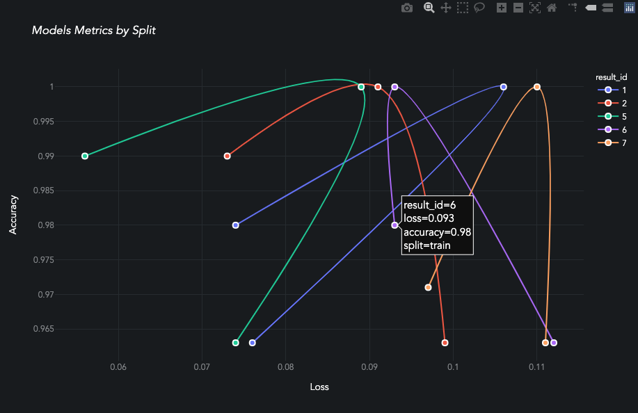
Queue Visualization
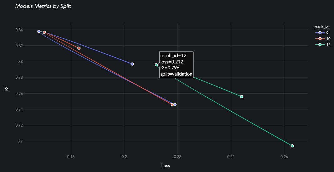
plot_performance aka the boomerang chart is unique to AIQC, and it really brings the benefits of the library to light. Each model from the Queue is evaluated against all splits/ folds.
When evaluating a classification-based Queue.analysis_type, the following score_type:str are available: accuracy, f1, roc_auc, precision, and recall.
[ ]:
queue_multiclass.plot_performance(
    max_loss = 1.5, score_type='accuracy', min_score = 0.70
)
Queue Metrics
[5]:
queue_multiclass.metrics_df(
    selected_metrics = None
    , sort_by        = 'predictor_id'
    , ascending      = True
).head(6)
[5]:
| hyperparamcombo_id | job_id | predictor_id | split | accuracy | f1 | loss | precision | recall | roc_auc | |
|---|---|---|---|---|---|---|---|---|---|---|
| 0 | 17 | 23 | 23 | train | 0.912 | 0.911 | 0.271 | 0.917 | 0.912 | 0.983 |
| 1 | 17 | 23 | 23 | validation | 0.810 | 0.806 | 0.317 | 0.822 | 0.810 | 0.966 |
| 2 | 17 | 23 | 23 | test | 0.963 | 0.963 | 0.240 | 0.967 | 0.963 | 1.000 |
These are also aggregated by metric across all splits/folds.
[6]:
queue_multiclass.metricsAggregate_df(
    selected_metrics = None
    , selected_stats = None
    , sort_by        = 'predictor_id'
    , ascending      = True
).head(12)
[6]:
| hyperparamcombo_id | job_id | predictor_id | metric | maximum | minimum | pstdev | median | mean | |
|---|---|---|---|---|---|---|---|---|---|
| 0 | 17 | 23 | 25 | accuracy | 0.963 | 0.810 | 0.063608 | 0.912 | 0.895000 |
| 1 | 17 | 23 | 25 | f1 | 0.963 | 0.806 | 0.065301 | 0.911 | 0.893333 |
| 2 | 17 | 23 | 25 | loss | 0.317 | 0.240 | 0.031633 | 0.271 | 0.276000 |
| 3 | 17 | 23 | 25 | precision | 0.967 | 0.822 | 0.060139 | 0.917 | 0.902000 |
| 4 | 17 | 23 | 25 | recall | 0.963 | 0.810 | 0.063608 | 0.912 | 0.895000 |
| 5 | 17 | 23 | 25 | roc_auc | 1.000 | 0.966 | 0.013880 | 0.983 | 0.983000 |
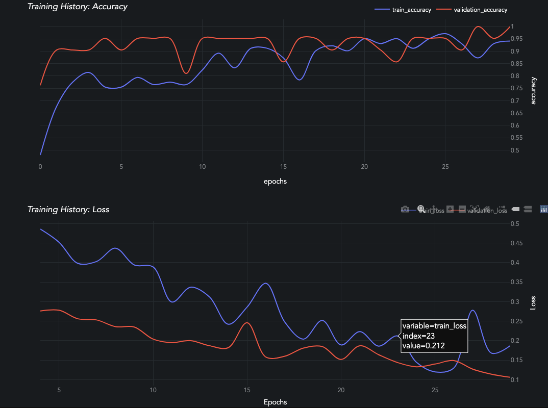
Job Visualization
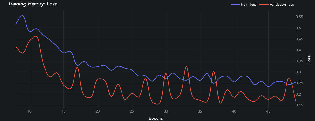
A learning curve will be generated for each train-evaluation pair of metrics in the Predictor.history dictionary. Reference the low-level API for more details.
Loss values in the first few epochs can often be extremely high before they plummet and become more gradual. This really stretches out the graph and makes it hard to see if the evaluation set is diverging or not. The skip_head:bool parameter skips displaying the first 15% of epochs so that figure is easier to interpret.
[ ]:
queue_multiclass.jobs[0].predictors[0].plot_learning_curve(skip_head=True)
[ ]:
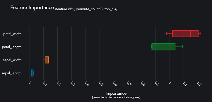
queue_multiclass.jobs[0].predictors[0].predictions[0].plot_feature_importance(top_n=4)
These classification metrics are preformatted for plotting.
[9]:
queue_multiclass.jobs[0].predictors[0].predictions[0].plot_data['test'].keys()
[9]:
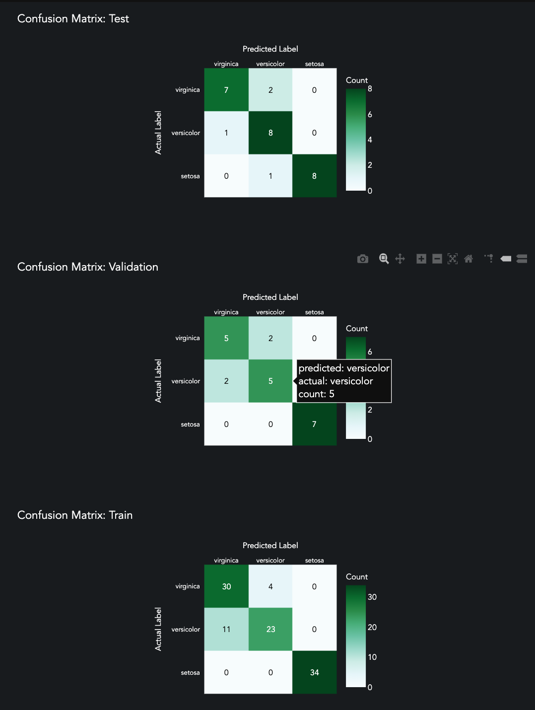
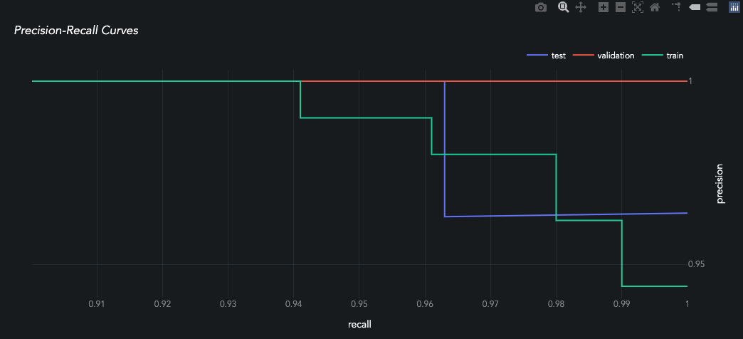
dict_keys(['confusion_matrix', 'roc_curve', 'precision_recall_curve'])
[ ]:
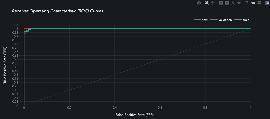
queue_multiclass.jobs[0].predictors[0].predictions[0].plot_roc_curve()
[ ]:
queue_multiclass.jobs[0].predictors[0].predictions[0].plot_confusion_matrix()
[ ]:
queue_multiclass.jobs[0].predictors[0].predictions[0].plot_precision_recall()
Job Metrics
Each training Prediction contains the following metrics by split/fold:
[13]:
from pprint import pprint as p
[14]:
p(queue_multiclass.jobs[0].predictors[0].predictions[0].metrics)
{'test': {'accuracy': 0.963,
          'f1': 0.963,
          'loss': 0.24,
          'precision': 0.967,
          'recall': 0.963,
          'roc_auc': 1.0},
 'train': {'accuracy': 0.912,
           'f1': 0.911,
           'loss': 0.271,
           'precision': 0.917,
           'recall': 0.912,
           'roc_auc': 0.983},
 'validation': {'accuracy': 0.81,
                'f1': 0.806,
                'loss': 0.317,
                'precision': 0.822,
                'recall': 0.81,
                'roc_auc': 0.966}}
It also contains per-epoch History metrics calculated during model training.
[15]:
queue_multiclass.jobs[0].predictors[0].history.keys()
[15]:
dict_keys(['loss', 'accuracy', 'val_loss', 'val_accuracy'])
Prediction Visualization
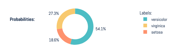
Multi-Label Classification Probabilities
[ ]:
queue_multiclass.jobs[0].predictors[0].predictions[0].plot_confidence(prediction_index=0)
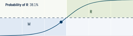
Binary Classification Probabilities
Also served by plot_confidence() for binary models.
Prediction Metrics
[5]:
queue_multiclass.jobs[0].predictors[0].predictions[0].probabilities['train'][0]
[5]:
array([0.98889786, 0.0101095 , 0.00099256], dtype=float32)
Regression
Let’s quickly generate a trained quantification model to inspect.
[18]:
%%capture
queue_regression = tests.tf_reg_tab.make_queue()
queue_regression.run_jobs()
Queue Visualization
When evaluating a regression-based Queue.analysis_type, the following score_type:str are available: r2, mse, and explained_variance.
[ ]:
queue_regression.plot_performance(
    max_loss=1.5, score_type='r2', min_score=0.65
)
Queue Metrics
[ ]:
queue_regression.metrics_df().head(9)
These are also aggregated by metric across all splits/folds.
[ ]:
queue_regression.metricsAggregate_df().tail(12)
Job Visualization
[ ]:
queue_regression.jobs[0].predictors[0].plot_learning_curve(skip_head=True)
[ ]:
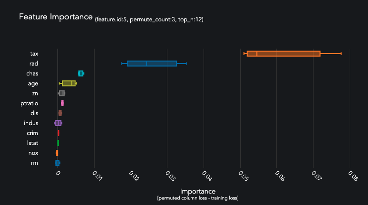
queue_regression.jobs[0].predictors[0].predictions[0].plot_feature_importance(top_n=12)
Job Metrics
Each training Prediction contains the following metrics.
[19]:
p(queue_regression.jobs[0].predictors[0].predictions[0].metrics)
{'test': {'explained_variance': 0.048,
          'loss': 0.754,
          'mse': 1.045,
          'r2': -0.045},
 'train': {'explained_variance': 0.036,
           'loss': 0.733,
           'mse': 0.971,
           'r2': 0.029},
 'validation': {'explained_variance': 0.048,
                'loss': 0.678,
                'mse': 0.822,
                'r2': 0.043}}
It also contains per-epoch metrics calculated during model training.
[20]:
queue_regression.jobs[0].predictors[0].history.keys()
[20]:
dict_keys(['loss', 'mean_squared_error', 'val_loss', 'val_mean_squared_error'])